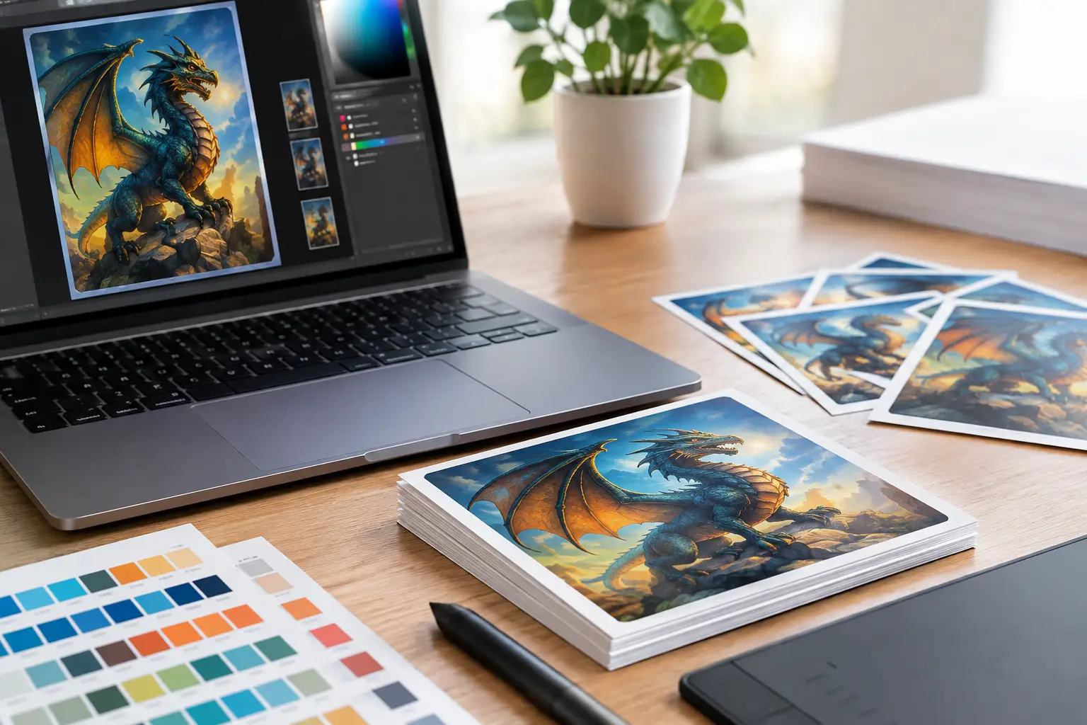
A great custom Lotería card starts long before the card text, border, or final print file. It starts with the photo. When you optimize images for card art, you give every person, pet, inside joke, and celebration memory the space to look clear, expressive, and instantly recognizable in a small printed format.
This does not mean every upload needs to look like a professional portrait. A phone photo can become beautiful card art when the subject is easy to see, the crop is intentional, and the image has enough visual information for a cartoon-style transformation. The goal is simple: choose photos that tell the story of your deck at a glance.
Start With Photos That Have a Clear Star
Lotería cards are designed to be read quickly. A player should be able to spot La Abuela, El Primo, or La Birthday Queen across the table without squinting or asking who is supposed to be on the card. Choose images with one obvious subject whenever possible.
A close-up of your dad laughing at a family cookout will usually work better than a wide group photo where he takes up a tiny corner. The same goes for pets, products, party details, and places. If the card is about your dog, pick a photo where your dog is the focus. If it is about the wedding cake, make sure the cake is not hidden behind a crowd.
Group photos can still have a place in a custom deck, especially for cards like La Familia, El Equipo, or Los Besties. Just use them deliberately. The more faces included, the smaller each face becomes once the image is cropped into card art. For a deck that feels cohesive, use mostly single-subject photos and save group shots for a few meaningful moments.
Choose Good Light, Not Perfect Light
Natural, even lighting gives cartoonified artwork more color, expression, and detail to work with. Photos taken near a window, outside in open shade, or in a well-lit room tend to create clean results. The subject’s eyes, smile, clothing, and key features are easier to preserve.
Very dark photos can lose important details. A face may blend into the background, or a favorite outfit may appear as one large shadow. Extremely bright sunlight can cause the opposite problem, washing out faces and creating harsh highlights. If you have several photos of the same person, choose the one where their features are easiest to see, even if it is not the most dramatic shot.
Color matters, too. A bright shirt, bold background, colorful flowers, or a recognizable setting can make a card feel lively. But if the background is busy, do not worry about trying to fix every detail before uploading. What matters most is that the main subject stands out from what is behind them.
Watch for Backlighting
Backlighting happens when a strong light source sits behind the subject, such as a sunset, window, or stage light. It can create a beautiful photo, but it may turn the person into a silhouette. If their face is too dark to recognize, choose a different image for the card or brighten it lightly before uploading.
Crop for the Card, Not for Your Camera Roll
Most personal photos are taken in a wide rectangle, while card art needs to perform in a more compact space. That means the best part of an image may not be the full original frame. A thoughtful crop puts the focus where it belongs.
For people, center the face and upper body when possible. Leave a little breathing room around the head, but avoid so much empty space that the person looks tiny. Do not crop too tightly through the forehead, chin, hands, or other meaningful features unless that close framing is part of the look you want.
For pets, leave room for ears, tails, hats, bandanas, or other details that make them unmistakably themselves. For objects, crop close enough that the item reads immediately. A margarita glass, graduation cap, tamale plate, or pair of sneakers should feel like the main event, not a small clue inside a crowded photo.
If the platform offers a crop preview, use it. Check that faces stay inside the safe area and that no important detail sits too close to an edge. Card borders, text, and print trimming can make edge-to-edge details feel cramped. A little margin helps your finished deck look polished.
How to Optimize Images for Card Art Before Uploading
You do not need advanced editing software to prepare photos for a personalized deck. A few quick choices are enough to make uploads more consistent and print-friendly.
First, use the original image when you can. Images saved from text messages, social media, or screenshots may be smaller or more compressed than the photo in your camera roll. The original usually holds more detail, which helps preserve clean edges and facial features in the final art.
Second, avoid heavy filters. A subtle brightness adjustment is fine, but strong beauty filters, extreme contrast, dramatic color effects, or added stickers can compete with the artwork transformation. Let the personality come from the photo itself: the grin, the pose, the outfit, the setting, and the memory behind it.
Third, rotate images before uploading if they appear sideways. It sounds small, but a properly oriented photo saves time when you are building multiple cards. If an image is blurry, pixelated, or badly out of focus, replace it when possible. Cartoon-style art can be playful, but it cannot reliably invent details that were never visible in the original.
For a family deck, gather your images in one folder before you begin. Name files by person or card idea, such as “Tia Rosa,” “The Twins,” or “Birthday Cake.” This makes it easier to move through the creative process without losing track of which photo belongs to which moment.
Build a Deck That Feels Like One Collection
A custom Lotería deck can include photos from different years, phones, vacations, and family albums. That variety is part of the charm. Still, a few consistent choices will make the finished deck feel intentional.
Try to keep the subject scale similar across most cards. If one person’s card is a close portrait and another person appears as a tiny figure across a beach, the deck may feel uneven. You do not need identical poses, but aim for a similar visual emphasis.
Think about backgrounds as part of the collection. You might use colorful party photos throughout, choose mostly simple home and outdoor settings, or mix in a few meaningful landmarks. If every background is wildly different, the cartoon transformation and card theme can help bring things together. Consistent card text, framing, and color choices do a lot of visual work.
This is also where personalization becomes especially fun. Give each card a name that matches the image and your group’s sense of humor. A serious-looking cousin can become El Jefe. The friend who always brings snacks can become La Botana. A card featuring your cat in a sunbeam might be El Rey del Sofá. The best card text is recognizable, affectionate, and easy to call out during the game.
Make Room for Meaningful Details
The strongest custom decks do more than replace traditional illustrations with photographs. They capture the details your people will notice first: a grandmother’s signature earrings, a toddler’s superhero cape, a family ranch, a school mascot, a favorite food, or the flowers from a wedding day.
When selecting photos, ask one practical question: what should someone remember when they see this card? If the answer is a person, make their face and expression visible. If it is a place or object, frame the feature that carries the memory. You are not documenting every part of the moment. You are choosing the visual clue that brings the story back.
For event decks, balance faces with symbols of the occasion. A wedding deck might include the couple, wedding party, venue, cake, signature cocktail, dance floor, and a few playful guest moments. A reunion deck can celebrate relatives alongside the family home, favorite recipes, and traditions everyone knows. This mix keeps gameplay fresh while making the deck feel deeply personal.
Preview Like a Player and Like a Printer
Before generating final files, look at your cards as a full set. Can you recognize each subject quickly? Does the card text match the image? Are any faces too small, too dark, or cropped awkwardly? A preview is the best time to swap in a stronger photo or refine a crop.
Then consider the physical card in someone’s hand. Fine details may look great on a large screen but become less noticeable in print. Prioritize clear subjects, readable text, and enough contrast between the artwork and the card design. Professional print-ready files work best when the artwork has already been given a clear, intentional role.
Modern Lotería Studio makes the creative path straightforward: upload your photos, cartoonify them, customize the card text, and generate print-ready cards and game boards. Your best contribution is choosing the images that deserve a place in the deck.
The photo does not have to be flawless to become a favorite card. Pick the one that makes your family laugh, brings a guest back to a special day, or makes someone say, “That is so you.” Give that memory a clear crop, a great name, and a spot at the table.